Reference Data
2019–20
Data and AI, IBM Design
Helping users meet their data quality standards by creating an experience to capture, manage, and socialize reference data—all in one place.
As part of a data governance overhaul, I was tasked with designing the MVP experience for managing reference data within IBM’s data and AI platform.
The team
Myself – UX + Visual Design
Ashwin Umathay – Design Lead
Kathy Alvero – User Research
Duration
4 months
Outcome
🚀 Shipped in IBM’s data governance platform, Watson Knowledge Catalog, November 2019
So uh…what exactly is reference data?
Reference data categorizes other data within applications and databases. The essential structure is a code and value pairing (but usually a description tags along, too).
You probably already know of some examples. Do you know what USD stands for? What about AUD? Those are codes. A reference data set would organize those codes with their corresponding values—“United States Dollar,” “Australian Dollar” and so forth.
Reference data sets can be as simple as that—a flat list of currency codes—or they can be extremely complex, with deep levels of value hierarchies, each with relationships to other values—like the SNOMED CT, the largest collection of medical terminology.


Dominick the data steward

What he does
Dominick is a data steward at a banking institution. He’s the one in charge of ensuring his data meets the quality standards set forth in his governance policies, including reference data. He creates reference data sets and updates them as values or codes change.
His main pain points
With no central place to work with his reference data, Dominick must use ad hoc management methods (read: a bunch of manual spreadsheets).
This makes Dominick’s task:
Extremely tedious and time-consuming.
Risky—any inconsistencies could lower his data quality and put his institution at risk for non-compliance.
For the MVP, we scoped our work to solve for Dominick’s most pertinent needs:
I need a central place.
I need a central location to store my reference data so that others on my team can access it.
I need management capabilities.
I need a way to edit and add metadata to my reference data so it is accurate and understandable.
I need a workflow.
I need a way get the right people to approve changes and updates.
To the drawing board ✏️
Starting with the flow
A draft diagram of Dominick’s tasks gave us a sense for the big picture before we jumped into the specifics.
First iterations
We knew our biggest challenge would be creating a solid information hierarchy and balancing the information density so Dominick could see what he needed, but not be overwhelmed.

Creating balance
We addressed this challenge by utilizing panels to organize information: the left showing a list of existing sets, the middle showing the active set, and the right showing the metadata.

Determining the information hierarchy
Through these explorations, more questions came up: Would Dominick want to see his list of codes and values first? What about the metadata? How best would he understand what reference data set he is looking at?
User research 🔎
With a hefty list of questions and a mid-fi prototype, we sought feedback from users on the direction of our designs to help steer the course.
Goal
Gain insight into how users manage their reference data, and test our concepts to understand which actions and information match users’ mental models.
Method
We conducted 1-hour moderated sessions with three data stewards in the banking industry (including open-ended questions and usability tasks with a prototype).
What we asked 💬
“What's the most important thing you need to know about a reference data set?”
“How do you find which set you’re looking for?”
“What details about a set would you like to keep track of?”
Continued iterations
Subsequent iterations were guided by the feedback sessions, reviews with our product managers and developers, and peer critiques with other designers.

Considering scalability and relevance
Users didn’t find the list of existing sets all that helpful when looking at one set in particular.
Instead, I pulled that list onto its own page. Here I had the space to show many sets and more relevant details—a description, category, and status.
“I’m lazy—some sort of auto-fill would be nice. I don’t want to do too many steps.”
Reducing upfront tasks
I removed all optional fields from the import flow to reduce the upfront cognitive load and make the form less overwhelming for users. Fields were also pre-populated from their uploaded file’s metadata to help them get started.


Edit as they go
With sections marked as editable, users could continue to build out their reference data set metadata and details as needed before sending it to be approved and published.
Pairing corresponding information
I pulled some of the more pertinent metadata fields into the middle section, where they could be easily consumed.
Final design

I used IBM’s Carbon Design System to establish hi-fidelity visual designs.
Color and typography
Color strategically highlights the user’s primary actions and draws attention to interactive items. Field colors supplement the typography and help create visual hierarchy.
Spacing and layout
A consistent visual rhythm helps balance the information density and create order across the experience.
Reference Data: Part II
For the next release, I designed for Dominick’s more complicated use cases.
The team
Myself – UX + Visual Design
Ashwin Umathay – Design Lead
Kathy Alvero – User Research
🆕 Nicole Jones – Visual Design Apprentice
Duration
4 months
Outcome
🚀 Shipped in IBM’s data governance platform, Watson Knowledge Catalog, late 2020
🔴 Watson Knowledge Catalog wins 2021 Red Dot Award
🏆 Watson Knowledge Catalog wins 2021 iF Award
Prioritizing needs

Since the MVP release, the backlog of client requests for additional features filled up. We determined the following as Dominick’s next most important needs:

I need more metadata.
To help himself and his team understand their reference data values easily, Dominick needs to be able to add custom descriptor fields to each value.

I need a way to find where alternates live.
Since different parts of the world (or even different departments on his floor) might use different codes for the same thing, Dominick needs a way to map those alternate values.

I need to be able to define hierarchical relationships.
Remember the SNOMED CT? That giant catalog of health codes with multiple levels of parent and dependent values? Dominick needs a way to manage those hierarchical relationships and easily navigate them.
User research 🔎
We scheduled regular sessions with our sponsor users to capture their needs and help steer design decisions between iterations.
Goals
Gain insight into data stewards’ current use cases and pain-points for managing their complex reference data sets as well as validate our designed solutions each step of the way.
Method
A 2-day onsite visit with one client’s data governance team where we dived into their current use cases and pain points.
Nine 1-hour sessions with four clients. Sessions included open ended questions followed by tasks to assess usability for our prototypes—ranging from low to hi-fidelity.
Iterations and feedback
Leveraging IBM’s Enterprise Design Thinking and working within a continuous cycle of user feedback and iterations helped us craft the best experience for Dominick.
Working with the existing table
My initial inclination was to keep the existing table layout and retrofit it with the additional metadata. I played with information density and used progressive disclosure to reveal the secondary details of a row.
What we heard
“This is just overloading my brain right now.”
Users found this layout cluttered and overwhelming: lists blended together. They didn’t want to click too many times to expand the things they wanted to see.

How else might Dominick navigate a list of items and view those items’ details?
In my next set of iterations, I played with alternative layouts to the single table. I tried positioning the code and value pairings on the left and the selected value’s details on the right.
What we heard
“Being able to transition between viewing the hierarchy and viewing the details is a big deal.”
This layout fit users’ mental model of navigating through the hierarchy to find a value, and then drilling into the nitty gritty.
But depending on the industry, the need for hierarchies differed—some users didn’t have them, some only had a few levels, and some had deep levels (70+).


How could this view scale to accommodate both flat lists and lists with deep hierarchies?
Replacing the table with a tree structure helped condense the layout a bit, but as the user expands deeper into the hierarchy, the values cascade diagonally—leaving a lot of underutilized space.
What we heard
“I can traverse the levels pretty fast—this is very useful.”
Users liked this view for the ways it organized the hierarchy and kept the details separate.

How could space be utilized to show Dominick the most of what he cares about?
Separating each level into a different panel better used the available space. With horizontal scroll, this could scale from flat lists to infinite levels.
Users could either scroll horizontally through open levels or jump back to a specific level using the breadcrumb.
What we heard
“I can really get context for the parent-child relationships. ”
Users loved how the separation of values at each level and visible path made the relationships easier to understand.
Customizing the view
We heard from users that a table format would still be valuable, especially for the admin users who want to get a bigger picture and compare values within a set. I added the ability to toggle between the panel and table view.
I also added the ability for users to further customize their view—hiding and reordering sections to suit their needs.
Unfortunately, the table and customization were scoped out of this release and weren’t included in the final designs.
Final design

Expanding value hierarchies
Whether he has 3 levels or 20, Dominick can easily navigate to find the value he is looking for. The path is clearly visible to help Dominick understand the parent-dependent relationships between values.
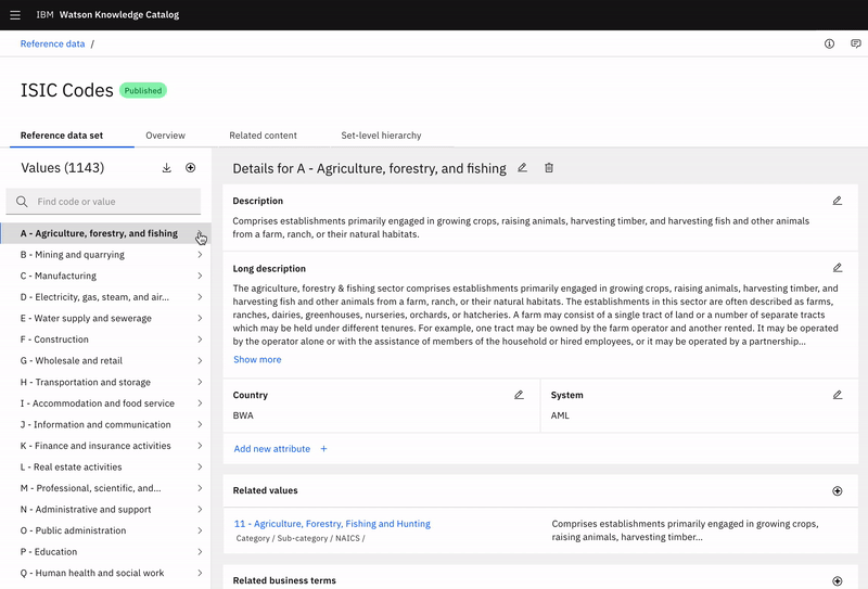

Adding related values
Dominick can search and select which related values he would like to add.
Once added, he can see that value’s name, location path, and description—letting Dominick know exactly where alternatives live and what they are.
What we heard
“This clearly gives you the flexibility to come in and find the values that you’re going to make changes around...I actually think this is better than what we have today.”
“When can we have it? This is great. You did a good job of taking our thoughts and throwing it into something. I see this could be very helpful for the business to be able to understand their data.”
“This is a massive jump forward [from last release] and I’m happy and impressed that we’ve got to this point.”
A few parting thoughts
The work I did for this release challenged me to make big decisions and defend them to stakeholders.
Changing the entire layout and functionality of a page was a hard sell to our developers and product managers, but by incorporating strong, supportive user feedback into my pitch, I was able to successfully get buy-in on what I felt would be the best experience for our users.
What’s next?
Everything is a prototype—we’ll continue to get feedback on these concepts and prioritize future enhancements to make Dominick’s task of managing reference data even easier and more comprehensive.
Much thanks 👏
Thanks to the rest of the design team, the development team, and all who had a hand in making this project happen.