Metadata Enrichment
Data and AI, IBM Design
2021-2022
Scaling the onboarding and classification of new data with AI-powered auto-assignment
First, let’s meet Dominick
Dominick’s roles and responsibilities
Dominick is a data steward who helps govern his organization’s data so that business users can easily find, trust, and use it.
How he does it
In order to make data findable and useful to others in his organization, Dominick must enrich the data assets by assessing its quality and assigning business terms and data classes.
His pain-points
Scale is Dominick’s main concern. Manual enrichment can be time consuming as there’s thousands of data to work through.
In his words
“It’s very cumbersome, there’s too many steps, it doesn’t happen fast enough”
We set out to help make Dominick’s task of enriching assets easier, faster, and more accurate with machine learning.
I joined the metadata enrichment team while this project was underway, so while I wasn’t a part of the initial concept design, I helped bring the it to the finish line with additional UX and visual improvements and collaboration with our engineering team during implementation.
The design team
Myself – UX + Visual Design
Susie Park – UX Design
Becca Urry – UX Design (concept)
Kathy Alvero – User Research
Duration
4 months
Outcome
🚀 Shipped in IBM Cloud Pak for Data
Collaborating with AI
One of the visual goals for this project was to help the user know where and how the AI was helping them so that they could understand where to focus their effort.
A dense wall of information
My main focus for this project was improving the table listing the metadata enrichment project’s assets. The existing concept had all the right info, but how was Dominick supposed to know what was most important, or what his next step should be?
A colleague’s initial concept exploration. It shows all the assets, their type, location, status, quality—as well as the main focus: the term and data class assignments.
Dominick can click on the business term column or View governance button to open the right side panel.
Using color and visual elements to highlight governance assignment
To highlight the term assignment column, I moved the number of suggestions into purple tags. This helps draw Dominick’s attention to his next step of choosing the term he wants to assign.
Using similar visual styles to create associations
With similar colors and shapes, Dominick will know that the score in the side panel is related to how highly the system suggests this specific term for assignment.
Actions at scale
Enabling a built-in workflow
We heard from users that a review status would help them manage their workflow and collaborate with other stewards.
To separate the review status from the enrichment status or data quality, I chose specific icons to represent the different phases. I used color sparingly to mark moments of completion.
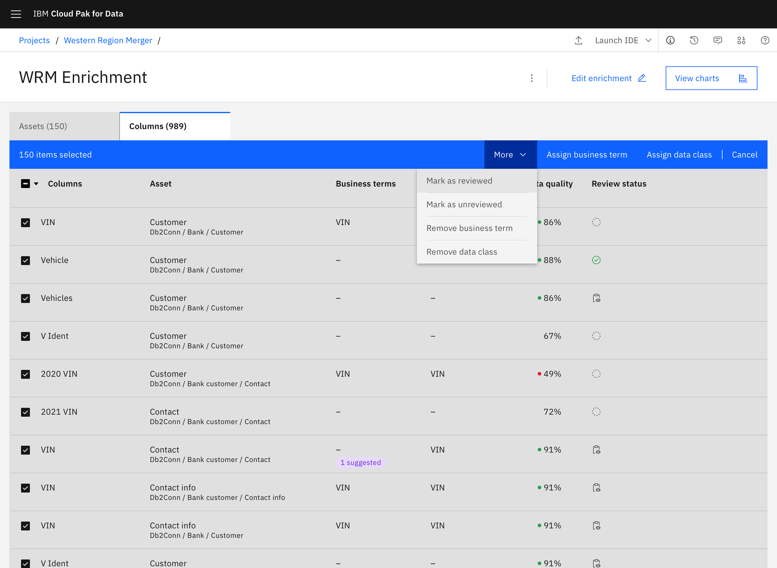
Bulk actions
Since one of the main pain-points we heard was dealing with large sets of data, enabling users to perform bulk actions was a high priority. Combined with filtering, this allows users to quickly act on specific subsets of assets in their project.
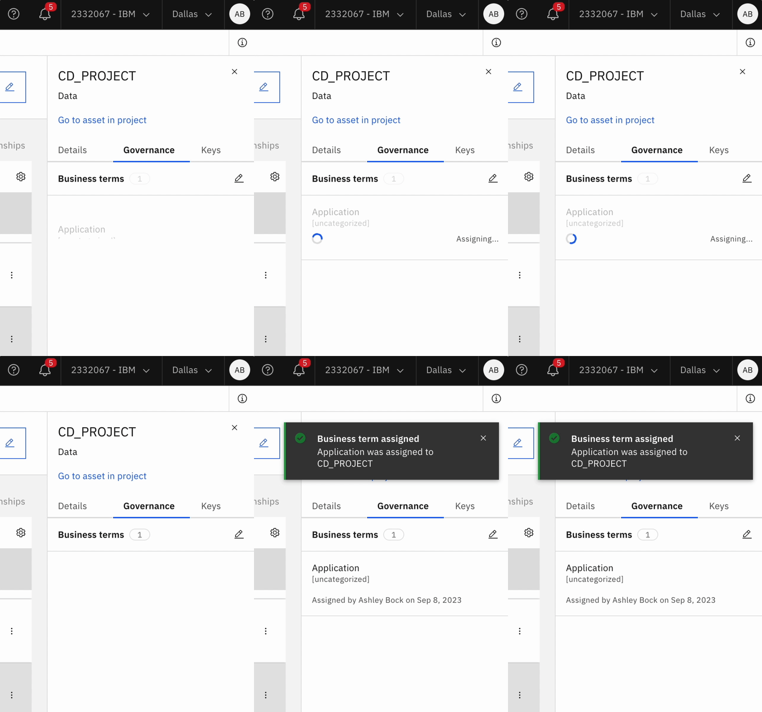
Microinteractions
To keep users informed of actions in progress, I designed a few microinteractions to add transitions between actions, loading states, and success or error states.
Final considerations
Importance of visual hierarchy to reduce cognitive load
This project required balancing a dense table of information along with a workflow of actions for Dominick. Supporting him with the right information to make choices without overwhelming him was a unique visual challenge.
Progressive disclosure
We accomplished maintaining a strong information hierarchy by utilizing progressive disclosure to hide supplemental information until Dominick really needed it.
Want to learn more?
Read my project manager’s blog post here.


